BRAND IDENTITY REFRESH
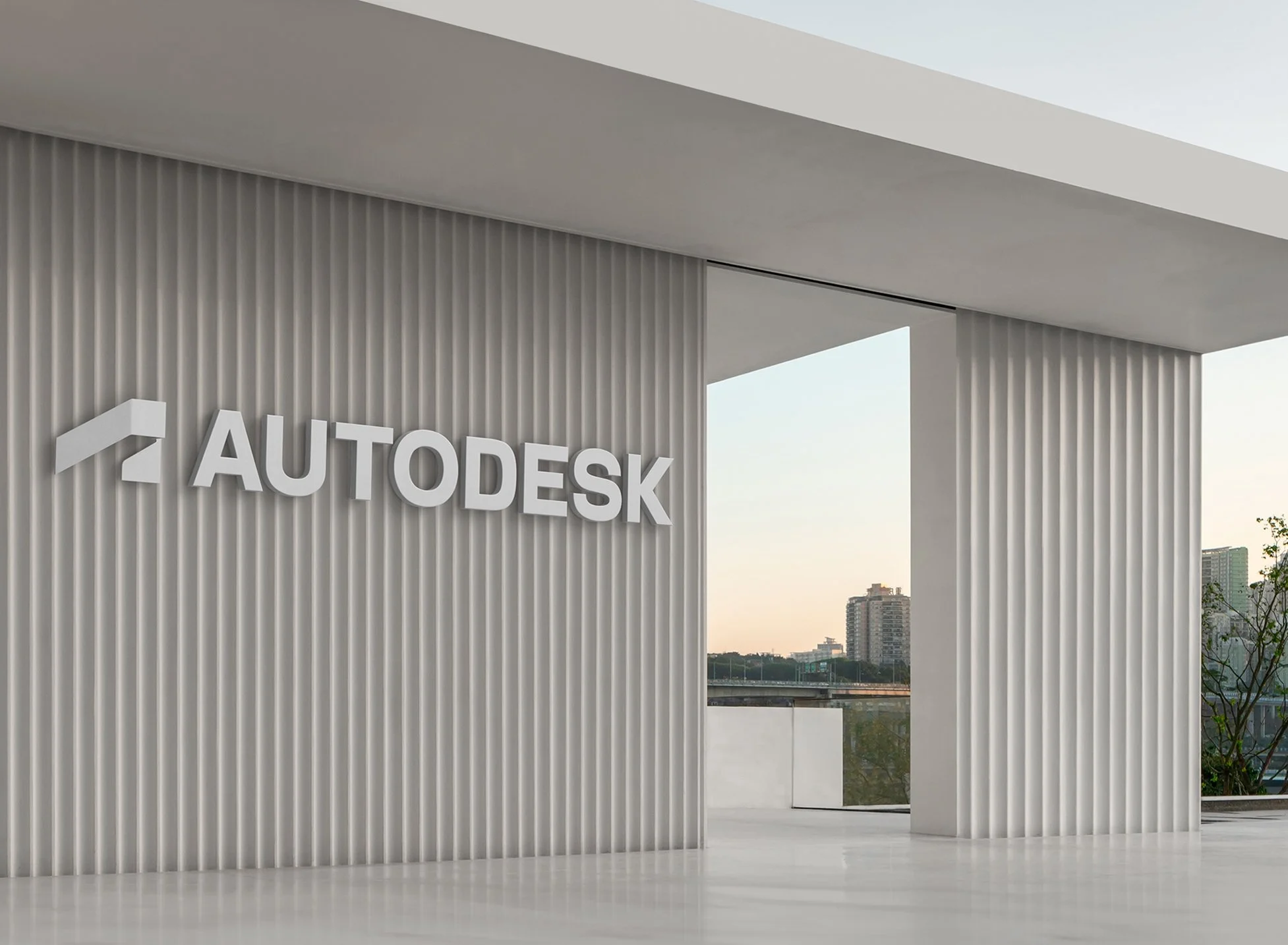
For nearly 40 years, Autodesk has been an industry leader in CAD technology and various software products that service the architecture, engineering, construction, manufacturing, product design, fabrication, and entertainment industries. As Autodesk continues to grow rapidly and evolve for a changing world, there was a growing awareness that although Autodesk products are popular and successful, users were unaware of its larger product offerings, and most importantly, the Autodesk brand itself.
Wieden+Kennedy was approached by Autodesk to strategically update the brand with a new position and reconcile its 100-plus products under a distinct and recognizable parent brand. The team at Wieden+Kennedy started by conducting Autodesk stakeholder interviews, gathering data and pain points, as well as conducting a comprehensive analysis of their existing brand architecture. From this evaluation, it became clear that Autodesk’s tone of voice was getting lost in a sea of sameness and the identity needed a strong parent-led brand that complemented a tight and scalable product system.
DD: Curtis Pachunka DP: Patrick Cahalan
Design: Hui OY, Luke Wilhelmi, Angela Iannarelli
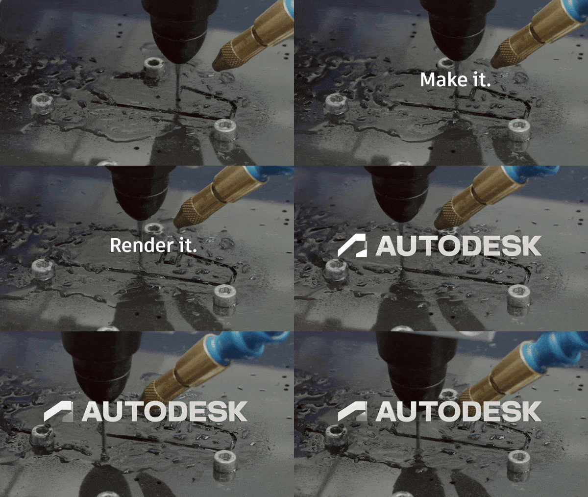
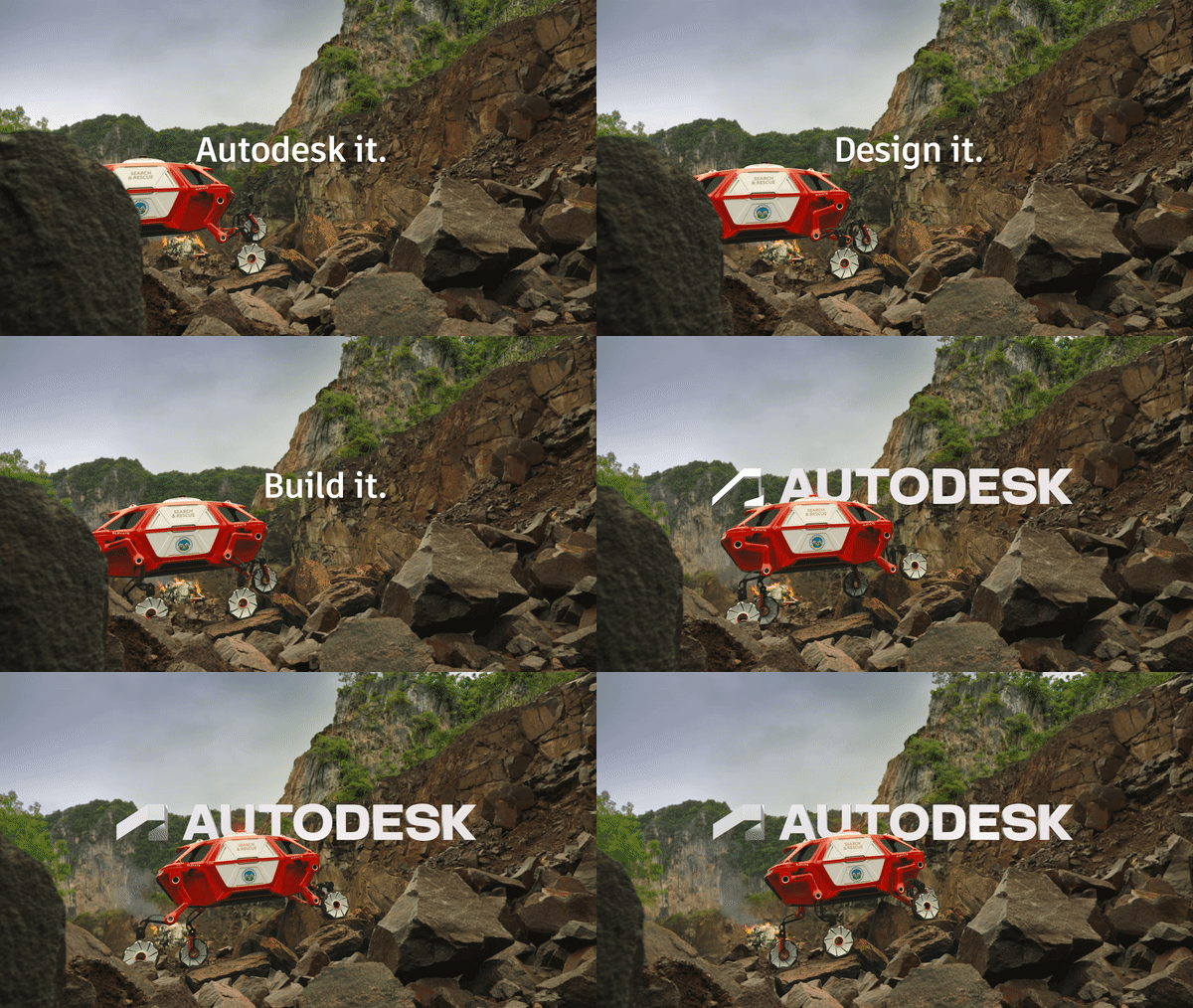
3D Renders: Greg Radich, Motion Design: Jeff Ackley
THE AUTODESK “A”
The many challenges facing the world right now call for radical new ways of making—with fewer resources, with less waste, with fewer boundaries between roles and industries, with more people and perspectives. Autodesk is already uniquely qualified for this moment, having built the infrastructure to help people who create do just that. Armed with this key insight, the W+K team recognized that the new brand needed balance real-world problem solving with the optimism of handling next-generation challenges.
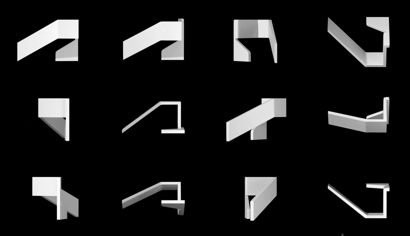
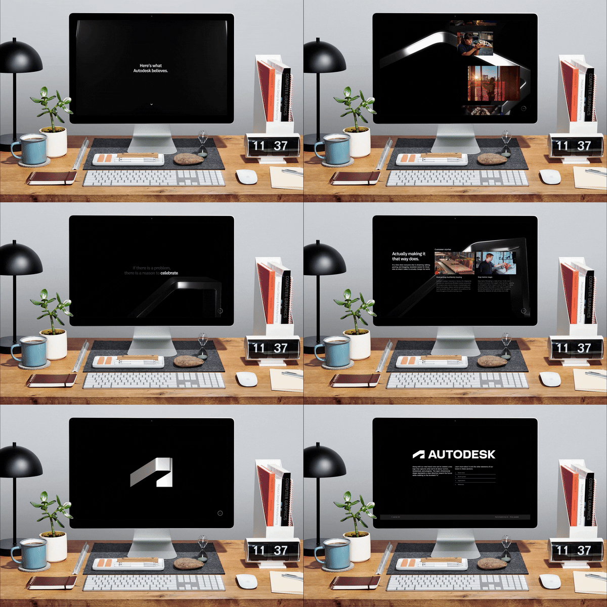
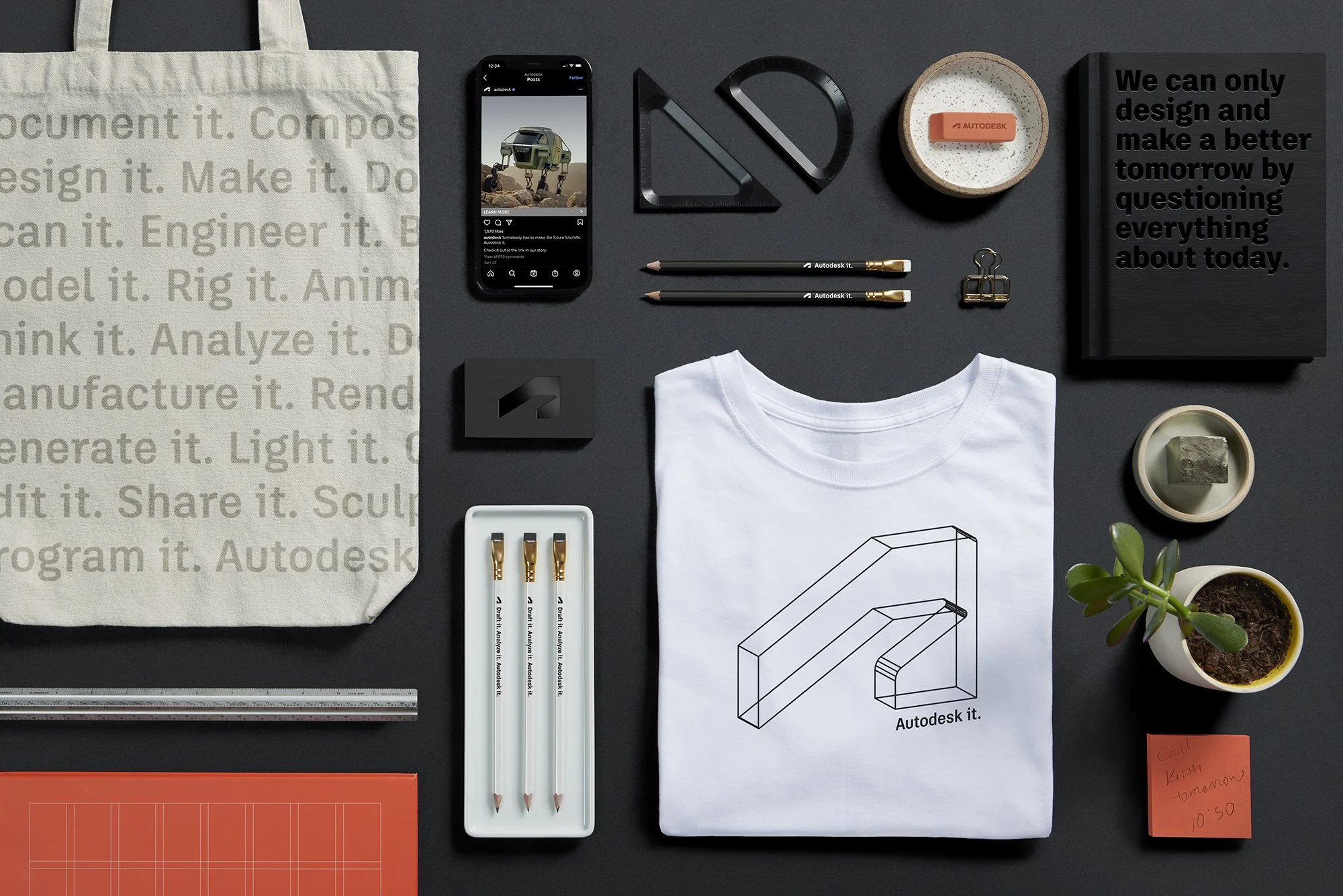
The visual identity is emblematic of these principles. The three-dimensional symbol that hints at the letter “A” is a nod to Autodesk’s legacy. But in this case, it is one that can be seen from different angles, maintaining a look
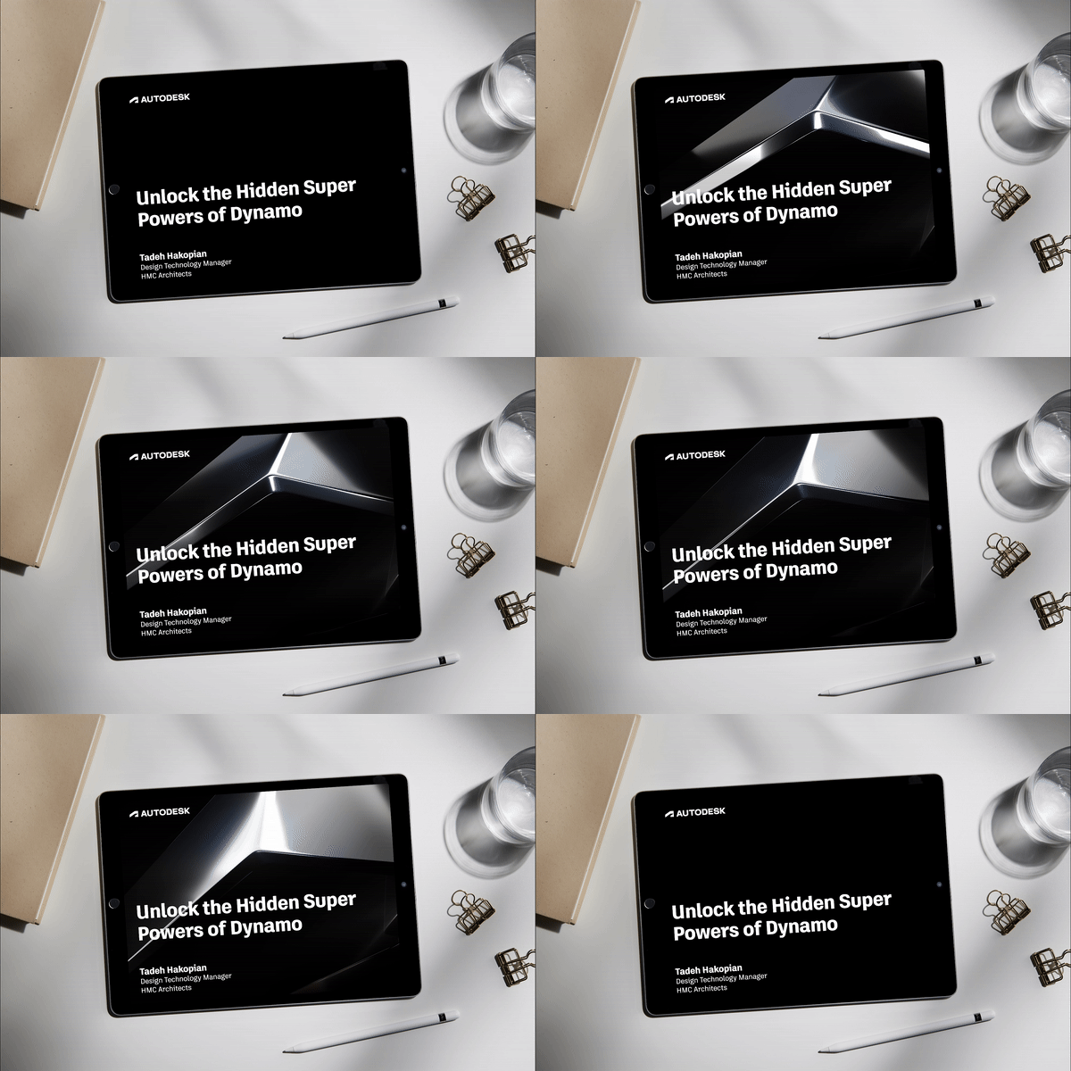
of development and abstraction, reflecting the range of conceptual thinking that the act of creating requires. In its flattened, graphic state, The symbol is bold with a sturdy foundation. It creates a dynamic symbol that launches the identity into the future. This symbol is further developed as brand imagery, taking on various materials and lighting to represent all the possibilities of the Autodesk software.
PRODUCT IDENTITY SYSTEM
In addition to the rebrand, Autodesk needed a scalable, comprehensive product identity system that closely correlates with the parent brand, but with the flexibility to encompass a wide range of adapted naming conventions from its 100-plus-and-growing product lineup. With a focus on clear hierarchy, visual cues were reduced so that the product was identified by a range of colors but otherwise united in look and feel. The parent colors of black and white universally pair with each product color, while giving prominence to the ever-present Autodesk brand.
UPDATED GUIDELINES
A new set of guidelines helped to lay out the usage rules for the new parent brand and product system, including our recommendations and strategies for layout, color, type, tone, and photography. All of which integrate the parent brand with authenticity and confidence moving forward.
